Around – Multipurpose Template
Jan 2021
Around is a responsive multipurpose website template designed to help companies look more professional, attract more visitors, and win more business opportunities with ready-made layouts and flexible components.
It supports a wide range of use cases, from marketing and startup pages to e-commerce, while maintaining fast performance and simple customization.
My Contribution
- Product Design
- Information architecture for pages
- Component-based section design for scalability
- Responsive layouts and interaction QA
Tools Used
- Sketch
- Adobe Suite
- Visual Studio Code
- Bootstrap 5
Overview
Around is a responsive multipurpose template designed to help teams quickly build modern websites and interfaces using a large library of ready-made pages, layouts, and UI components.
It provides flexible layout options, reusable design patterns, and a scalable structure, allowing users to efficiently customize and build interfaces for many different use cases.
Problem
Building modern web interfaces requires a balance between flexibility, scalability, and performance. However, managing many layouts, components, and use cases often creates complexity and inconsistency across projects.
Teams need flexible layouts without increasing development complexity
A lack of reusable components leads to inconsistent UI patterns
Scaling across many pages and use cases becomes difficult
Maintaining performance while supporting diverse layouts is challenging
Solution
Around provides a component-based UI system designed for flexibility and scalability, allowing users to quickly explore layouts, assemble interfaces, and build modern web experiences across multiple use cases.
- A comprehensive library of layouts, pages, and UI components for rapid prototyping
- Ready-made sections supporting a variety of product and business scenarios
- Consistent design patterns to maintain usability and visual cohesion
- Modular architecture for efficient customization and scalable development
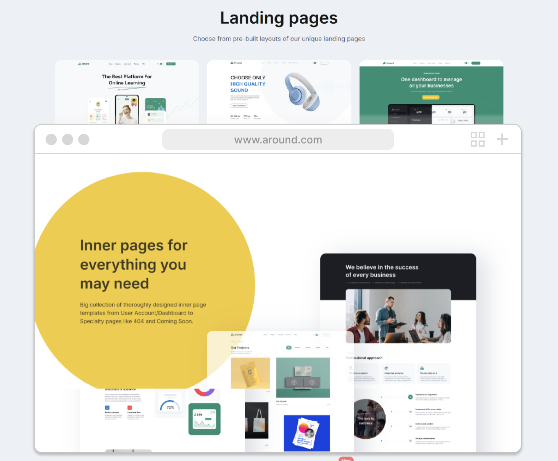
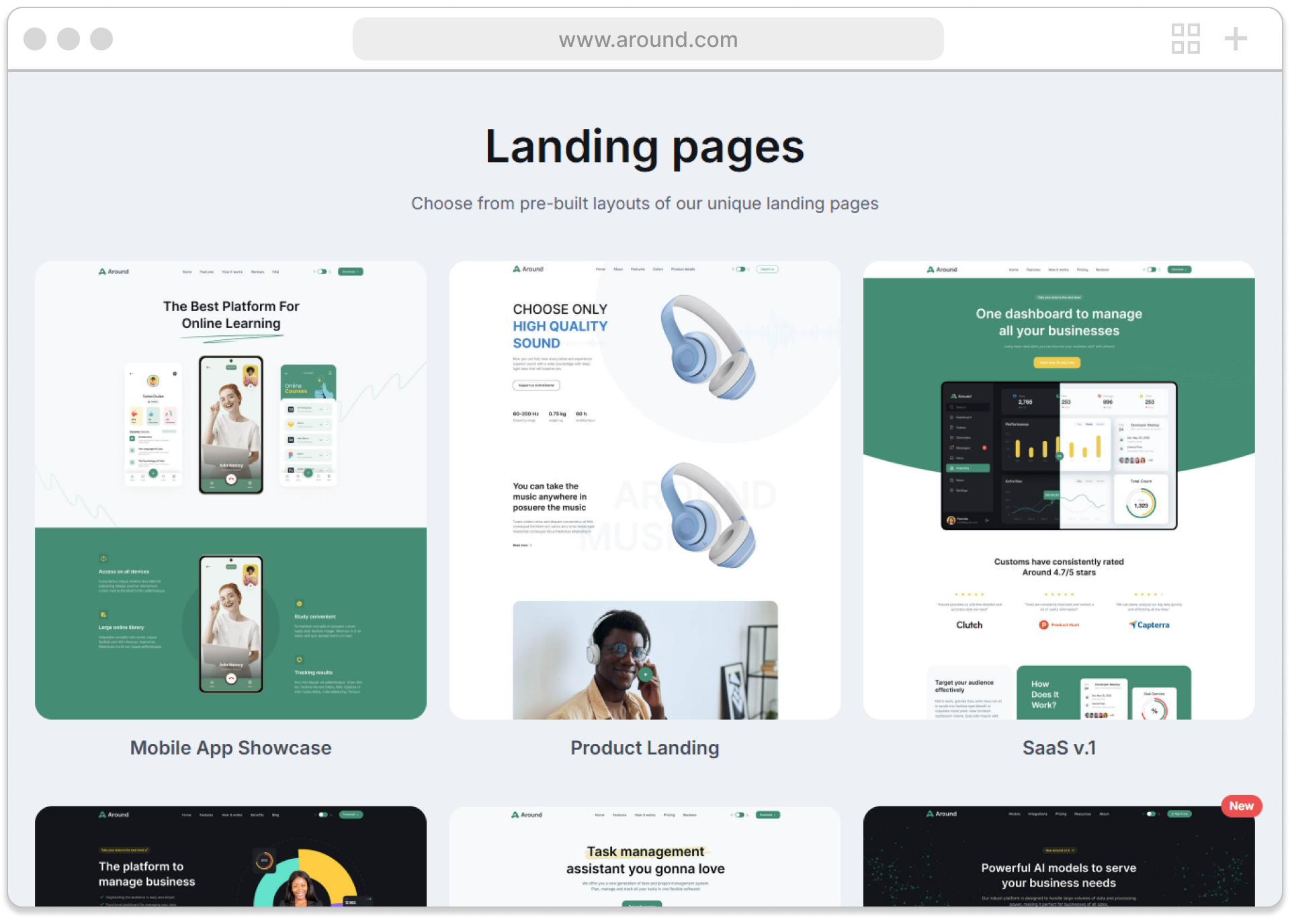
Key Features
- 200+ pages
- 100+ header variations
- 30+ homepage options
- Flexible layouts for professional business websites
- Pricing packages including community, 24/7 support, and e-commerce
Design Approach
The design approach focused on building a flexible and scalable UI system that balances clarity, consistency, and efficiency so users can quickly explore layouts and assemble interfaces.
- Component-based design patterns to ensure consistency and reusability across layouts
- Strong typography hierarchy to improve readability and scanning
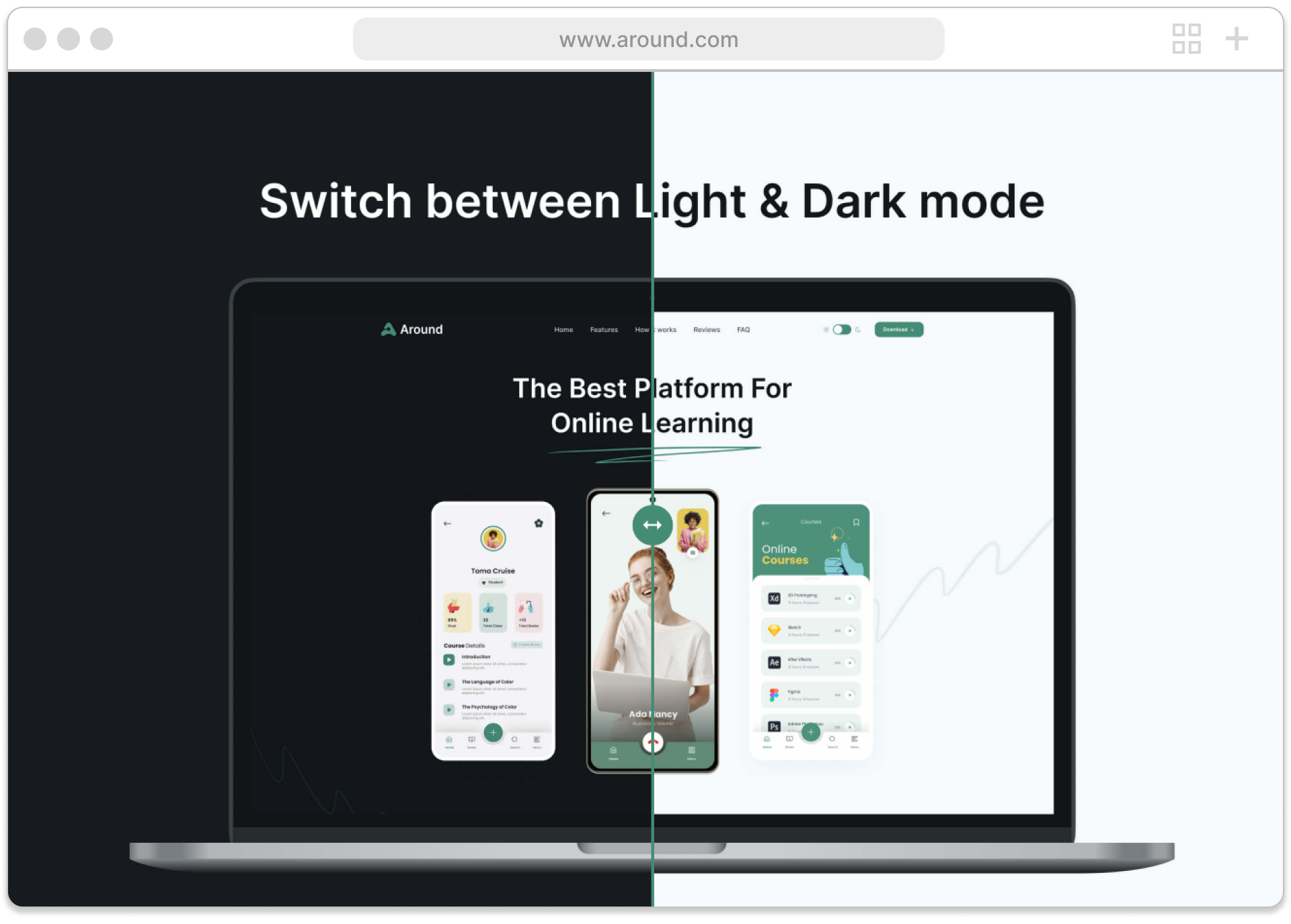
- Responsive-first layouts supporting multiple devices and use cases
- Modular structure enabling faster development and flexible customization
Design
Focused on creating a flexible, component-based experience that balances usability and scalability, allowing users to explore multiple layouts, understand UI patterns, and efficiently build modern web interfaces for different use cases.
Implementation
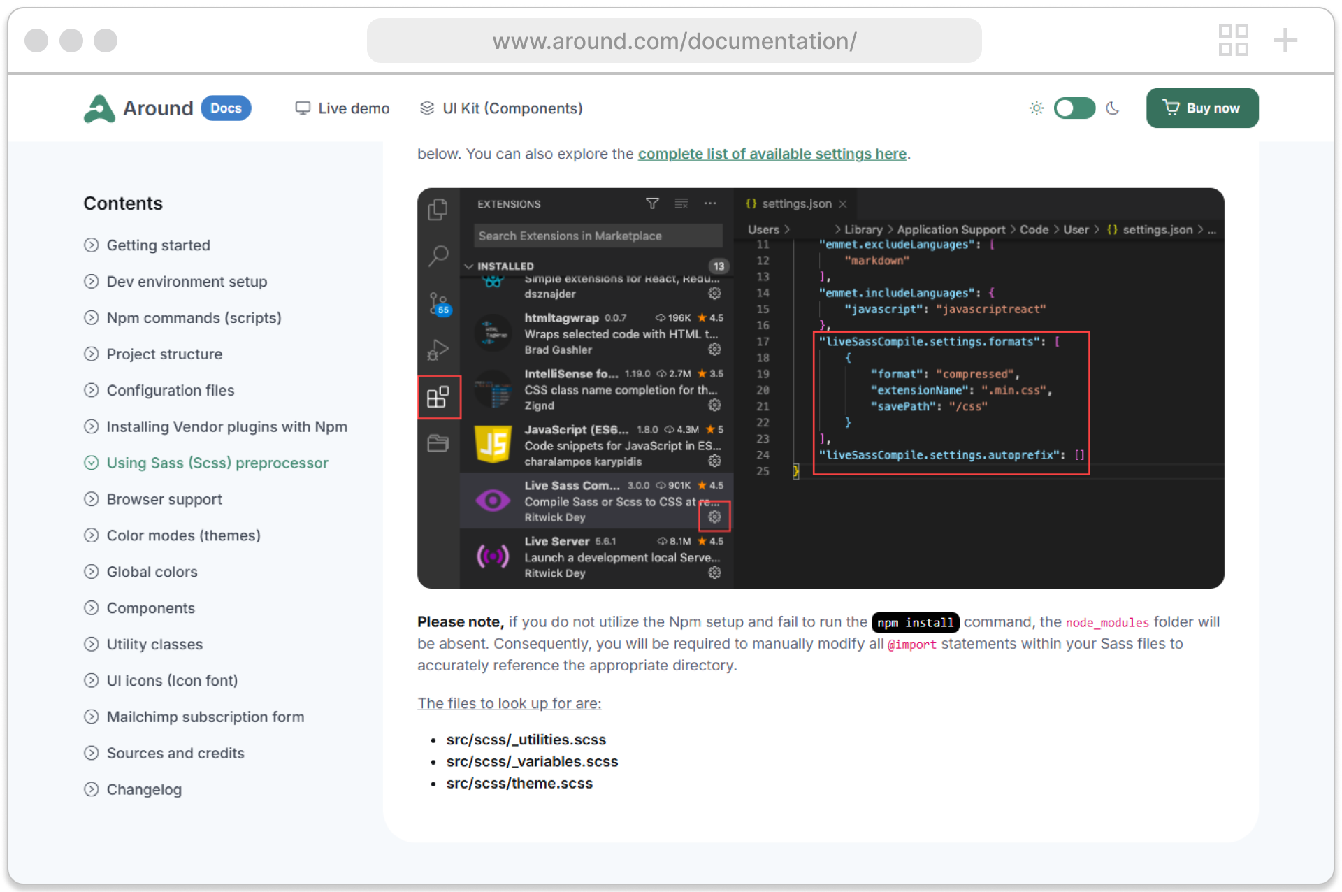
The platform was built with Bootstrap 5, focusing on modular and scalable architecture. A component-based system was implemented to support many layouts and use cases, enabling consistent UI patterns and efficient reuse across pages while maintaining responsive performance on every device.
Frontend Architecture
The frontend was structured around reusable UI components and flexible layout patterns. This approach ensures scalability, design consistency, and faster development, allowing users to easily customize and build interfaces for different product needs.
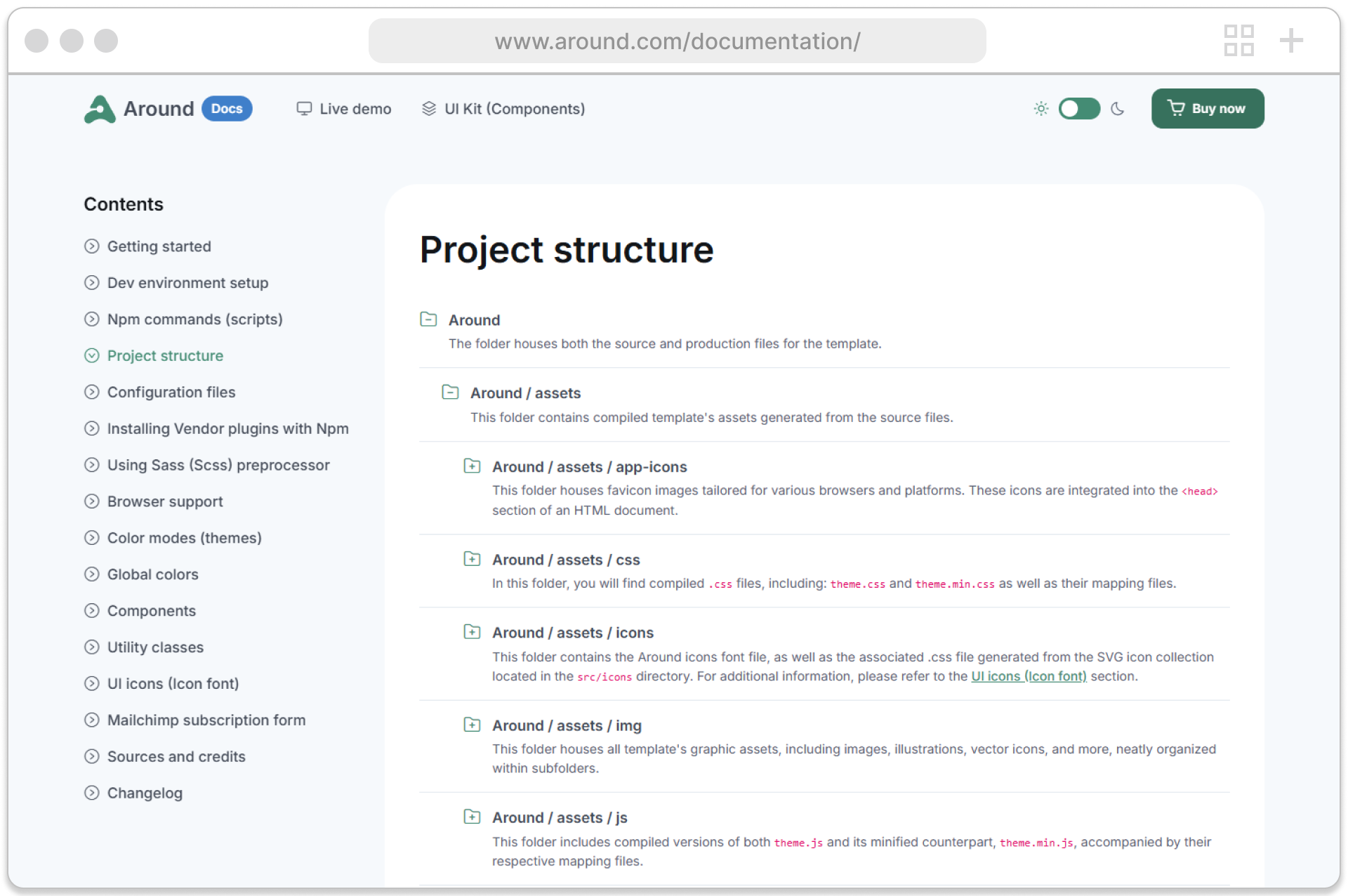
Frontend & Markup System
Developed a scalable frontend system using Bootstrap 5, built around reusable UI components, semantic markup, and modular layout structures. This approach ensures consistent design patterns, accelerates development, and supports flexible customization across many product scenarios.
Launch & Results
The platform launched successfully with a focus on performance, scalability, and usability. By connecting design and implementation, the experience allows users to quickly explore layouts, understand components, and efficiently build modern interfaces.
Deployment & Optimization
The platform was built with Bootstrap 5 using a modular, component-based structure. Continuous optimization was applied to improve performance, responsiveness, and usability, ensuring a smooth experience across devices and use cases.
Improved layout and component discoverability for faster exploration
Standardized reusable UI patterns for scalability and consistency
Improved usability through clear structure and intuitive navigation
Streamlined the user flow from browsing demos to building interfaces
Reflection & Outcome
Enabled users to efficiently explore, customize, and implement UI components through a flexible system. The improved experience supports faster development, better usability, and higher adoption across different product scenarios.
Other Projects
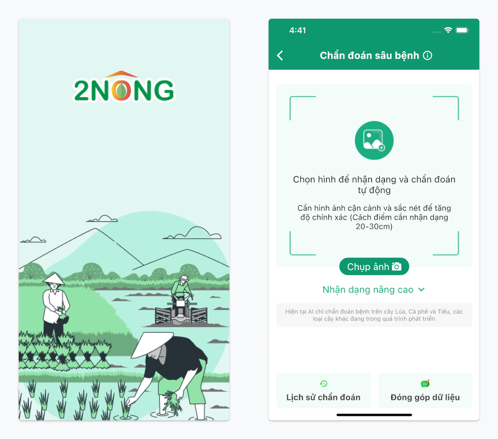
2Nong - Digital Farming Assistant
AI Crop Disease Detection
An AI-powered digital farming assistant that helps farmers detect crop diseases through image analysis and receive clear treatment guidance.
A unified design system
Healthcare Platform
Digital Maps
App Project Management
A corporate website for GIANTY
an App UI Kit on the subject of stocks
Queezy App UI Kit will help your Quiz
A professional Marketing Dashboard